A not-so-SMART schedule

Just a little off-center.

Just a little off-center.

Special for The Greater Marin by Martha Lauren.

It's happening. The SMART train is set to open its much-anticipated Larkspur extension next month, finally closing the gap between the train and the San Francisco Ferry – or at least, narrowing it to a slightly-too-long interchange walk next to some parking lots, lest we forget that we're in America.

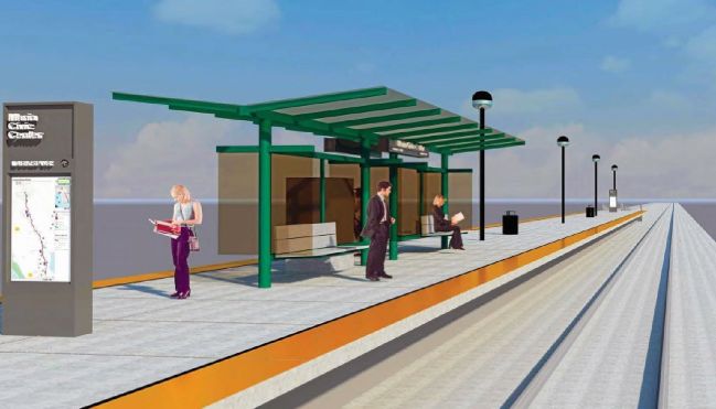
At the same time, Novato is to gain a new station adjacent to its compact downtown, where it ought to have been in the first place [1]. Service northwards to Downtown Windsor and the new station at Corona Road in the North of Petaluma are planned for 2021.

Last week a presentation was given to the SMART Board of Directors, outlining the new schedule planned alongside these changes. It allows for the additional calls and a modest increase in service from 34 to 38 trips per day, plus ten trains on weekends and holidays.

There is reason to temper any excitement, however. An examination of the proposed schedule [2] reveals a number of compromises built-in.

Late to rise, early to bed

Firstly, early morning southbound service appears to be eliminated, with service beginning at 6:01 am rather than the present 4:19 am. Last trains remain disappointingly early.

It's unclear why. There may be an intention to start two trains out from Novato in the morning, which would make some sense in terms of maximizing efficiency and recruiting staff from a wider area.

But the evening schedule shows Southbound service ending early and all trains ending up back at the Northern end of the line. So either in the morning or the evening, trains must run out of service into Larkspur.

This no doubt saves a few minutes of staff time, but is ridership really so lacking that operating trains in service isn't worthwhile? That would seem surprising in light of the newly convenient ferry connections to San Francisco.

The 32-minute schedule

Another major compromise built into the schedule is that the present 30-minute peak headway becomes every 32 minutes. This is contrary to best practice across the world, where clock-face schedules are favored.

Clock-face schedules see departures at the same minutes past each hour. This means a memorable schedule that allows riders to always know the next departure, and that each trip sees the same convenient transfers with connecting routes.

Last week's presentation clearly emphasizes integration with other modes – the ferries and their 30-minute peak headway, regional buses like GGT route 40 to El Cerrito with its 30-minute peak and hourly off-peak headways, and local buses across the network. A 32-minute headway means either mediocre connections or imposing an irregular schedule on every transit route in the region.

This was all well understood when SMART was built, with a 30-minute frequency built into the infrastructure. The passing sidings were placed 13-14 minutes apart so that a Northbound and a Southbound train could, in turn, clear each single track segment in just under 30 minutes.

However, with the additional station stops in Novato and Petaluma adding about two minutes each to journey times, it becomes difficult to maintain the schedule as it stands.

Staying on the Clockface

So there is considerable value in maintaining a 30-minute schedule in order to maintain convenient regional connections. Ideally, SMART could ensure that trains are dispatched promptly, and squeeze out the performance required to maintain 30-minute headways reliably.

Failing that, another compromise is seen across legacy lines in the UK where clock face schedules were introduced. As needed, relatively low ridership stations would see only alternate trains calling. For each train that calls the one in the opposite direction skips, and they, in turn, clear the track segment in the necessary time.

Having conducted a rough analysis of distances, speed limits timings on the route, I found the current schedule is fairly tight south of Petaluma, so making an additional call in Novato is indeed a challenge. North of Petaluma, where line speeds are higher, there appears to be a little more slack in the schedule, provided trains perform reasonably well at reaching 79mph speeds.

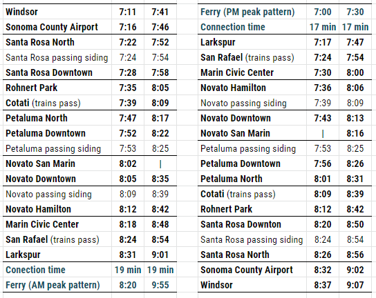
As such, the best-case 30-minute schedule would see alternate trains skip one stop in Novato. San Marin station is the obvious candidate, having much less within walking distance than the downtown station. The other half would make the stop, but then have priority passing through the siding at Petaluma, yielding a 30-minute pattern like this:

SMART Pattern A.PNG

Should trains have trouble keeping schedules in Petaluma and/or Windsor, it may be necessary to further introduce hourly service to Petaluma North and/or Sonoma County Airport. In the latter case, riders could board the first train that comes and ride through Windsor if necessary. This would yield a 30-minute pattern like this:

SMART Pattern B.PNG

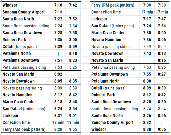
Similar patterns could be applied to hourly service at off-peak times, with some two-hourly calls, should such service be implemented.

Note that the same pattern used both AM and PM would yield good connections with ferries at Larkspur in the peak direction, without ferries and trains drifting apart in two-minute increments.

The 64-to-30 minute schedule

Though some service gaps are eliminated, some in the morning peak remain as 64-minute gaps. While four trains in service are promised over the current six, in fact, the sixth unit only comes out for one evening return trip, leaving the morning service one train short.

This may well relate to the perennial difficulty in recruiting staff [2]. But it is a considerable inconvenience to riders and will undermine the assurance that a train is always coming soon (at least at peak times).

In the mid-day, large gaps are proposed, nominally for maintenance. Such is unusual, with modern regional railroads aspiring to at least hourly midday and evening trains. This is accomplished by undertaking light maintenance in gaps between trains, heavier maintenance at night, and major works during the occasional full weekend shutdowns.

Towards a more regular train service

Granted, many of the issues outlined here relate particular challenges, like the difficulty of recruiting blue-collar workers in an expensive region and the single track infrastructure.

Nevertheless, it is of great importance that Sonoma and Marin remain on the path to a high-quality regional transit system. This means operating as efficiently as possible now, but also keeping the aspiration for a regular regional train service in mind, and doing everything possible to achieve it.

That includes a clockface schedule in which additional trains can easily be inserted when resources become available. Such as that sixth train in the morning schedule or an hourly mid-day service.

It also includes integrating infrastructure and schedule planning. Consideration of more stations should take place alongside consideration of how to maintain service, with measures such as longer passing sidings and improved speeds. Or in the longer term, extensive double-tracking and/or electric trains, the superior acceleration of which permits more stops in a given trip time.

At best, the train can be the engine of its own success. Regular transit service, combined with planning measures that allow housing for various incomes close to stations, can create the sort of growing and diverse regional economy that attracts both riders and the workers required to serve them.

Works Cited

[1] Edmondson, David. ‘Downtown Novato Is a Better Place for a Train Station’. The Greater Marin (blog), 8 September 2015.

[2] Houston. ‘SMART Pitches New Train Schedules, Announces Larkspur Opening’. Marin Independent Journal. 21 November 2019.

[3] Prado, Mark. ‘North Bay Housing Costs Have SMART Scrambling for Engineers’. Marin Independent Journal. 23 July 2016.

[Image] Maurer, Jim. 20180114_3389.jpg. 14 January 2018. Photo.

What if the Bay Area had never lost its railroads?

With the Northwestern Pacific reopening up soon as a limited commuter rail service - even though it need not - one wonders what the Bay Area would have looked like had it reinvested in its rail lines over the years rather than just rebuilt them. Well, it probably would look something like this:

Map by Theo Ditsek. Click to go to his post, where you can find a full-size image.

Map by Theo Ditsek. Click to go to his post, where you can find a full-size image.

I am always pleased to see our region's transit system reimagined by others, but I'm especially happy to see Theo Ditsek, one of the internet's more prolific transit map hobbyists, tackle the Bay Area, and tackle it like he did. From what I can see, he didn't leave a single rail line unused: there are rail lines from West Marin to Sausalito, subways through San Francisco, commuter rail to Santa Cruz, and shuttle lines heading every which way. My favorite, though, is the railroad to Tahoe.

Perhaps my only complaint is the lack of rail links from Marin and Vallejo to San Francisco, both for commuters and long-distance travelers. Beyond this, however, it's a truly marvelous piece of work. Now if only I could get it as a poster...

SMART's new shelter designs are even worse than before

SMART may be on the verge of making a serious mistake. Back in August, 2014, the rail agency released its “65%” plans for stations to decidedly mixed reviews. Stung by the criticism, particularly from San Rafael mayor Gary Phillips who called the designs “ridiculous”, SMART went into a long internal huddle.

Shelter Option 1, from SMART’s “65%” station design

Last Wednesday, at its Board meeting, SMART offered something new. Focusing mainly on platform shelters, it proposed an alternative to the forest green “Option 1” design included in the 65% station drawings.

The new shelters, inspired by bus stops, use a “standing seam hip roof design” and are being referred to as “Option 2”. They are proposed to be painted black, although SMART staff seems willing to allow cities to paint them any color in the rainbow. Cities will have until March 31st to tell SMART whether they want this new shelter or prefer to stick with Option 1. Based on the feedback from SMART Board members, it appears that cities will be lining up for Option 2.

An inspiration for “Option 2” – Bus shelter in Duluth, MN

That’s unfortunate. The new Option 2 design has many serious downsides and will likely be viewed with regret once SMART begins its operations. Moreover, switching them out for something totally different later on may not be easy.

SMART is waiting until the shelters are chosen to lay a top slab of concrete on its station platforms. That implies that the details of the top slab (for things like utilities or drainage) are tailored to a specific shelter type. A switch to a different shelter in the future might require demolishing the tops of platforms, which would be costly and time-consuming. Given that, it’s far more critical for SMART get this decision right than it would be for a typical bus operator.

So what’s wrong with Option 2? Several things. A good rail platform shelter should have the following characteristics:

  • A very narrow footprint and open design to avoid getting in the way of customers circulating on the platform.
  • A broad canopy with an appropriate height to maximize weather protection; and
  • A nice aesthetic that is compatible with its surroundings.

Option 2 misses the mark on all of these.

Shelter Footprint

Space on SMART’s platforms will be very limited. It’s “side” platforms will be 15 feet wide, while its “center” platforms (set between two tracks) will be 18 feet wide. Let’s consider the larger of these two.

Center platforms will have two, 24 inch wide, nubby, tactile warning strips; one along each platform edge. That leaves about 14 ft. of room for patrons, or about 7 ft. on each side of the platform. With shelter Option 1, the footprint will extend about 2 ft. out from the platform center line on each side, leaving two, 5 ft. “travel lanes” on each side of the shelter. That’s manageable.

By contrast, the Option 2 shelter is much, much wider. It will extend a full 4½ ft. out on each side of the platform center line, leaving a very narrow 2½ ft. on each side of the shelter. That’s untenable.

A visual simulation on a PowerPoint slide from SMART’s recent Board meeting shows the full horror of this future condition (1:04:47 mark).

Screen capture from SMART PowerPoint – Feb 18, 2015 Board Meeting

To make matters worse, the narrow 2½ ft. width between shelter and warning strip isn’t just a single choke point that customers will have to navigate around. The Option 2 shelters are only open one side, meaning that the “closed” side will present a long, continuous, 2½ ft. channel between platform edge and the solid glass wall of the shelter. SMART is proposing to ultimately add two or three of these monster shelters to each platform.

Suspended four feet in the air, SMART platform’s will be narrow islands, sometimes crowded with people, and far more populated with bicycles, wheelchairs, strollers, and luggage than a typical bus stop. The Option 2 shelters are going to pose great difficulties to circulating customers when SMART is in operation. While they may not violate the letter of the Americans with Disabilities Act (ADA), they certainly violates the spirit of it. Amazingly, only one SMART Director (Russell) raised any concern about space constraints.

The green Option 1 shelters will allow for far more space on the platforms. However, SMART’s 30% station design shelters had a key advantage over both Option 1 and Option 2. They were porous. They did not have a continuous wall of windscreens separating one side of the platform from the other. This openness would allow for more platform space and for customers to freely move from one side of the platform without having to go all the way around a bulky and long shelter.

SMART 30% Station Design

Weather Protection

At Wednesday’s meeting, SMART Director Kellner speculated that the Option 2 shelter would offer better weather protection than Option 1. In fact, the opposite is true. The canopies of the Option 1 shelter span 12 ft., while the heavier canopies of the Option 2 shelter only span 10 ft. and provide less coverage.

Moreover, the Option 2 canopies only offer weather protection on one side, according to SMART’s drawings. On the “closed” side of the shelter, the roof only extends a few inches over the wall of long glass, which will offer no weather protection at all.

The one-sided and enclosed nature of these bus stop shelters prevents customers from easily and casually ducking under the canopy on a rainy or hot sunny day. They have to deliberately and consciously move into the enclosure on one side, squeezing through the 2½ ft. wide choke point.

Aesthetics

Much of the politicians’ comfort with Option 2 seems to stem from the look, which avoids garish green paint and offers a more familiar shape. In the words of SMART Director Mouton-Peters, it “fits the cultural ethos” of Marin. The new shelter design was reportedly partly inspired by the shelters at the San Rafael Transit Center.

While beauty is subjective, I doubt most Marinites cherish the Bettini Transit Center’s shelters. Without a doubt, the most beautiful things in Marin County are inherent in the place itself: the green and gold rolling hills, the oak trees, and the historic town centers.

The best thing that a transit shelter can do in this environment is to stay simple and clean and get out of the way. SMART Director Rabbit offered some of this perspective when he wondered if these big, black, bus shelters might end up blocking views of more cherished places and structures near the stations. They will.

Little House on the Platform

A misguided approach on shelter design can begin easily enough. When most people think of a “shelter”, the most comforting image that comes to mind is a house. Then, when people think of an iconic shape for a house, the most classic vernacular is a triangular pitched roof. In fact, SMART staff noted that the new Cotati Depot building also partly served as an inspiration for the Option 2 shelters.

Unfortunately, a triangular roof that drains water into gutters on either side tends to be very heavy. It’s not structurally possible to cantilever the canopy very far. Moreover, the weighty triangular roof can’t be supported easily by narrow support columns in the center. It requires a much wider base, just like a house. That leads to bulk. The problem is that rail platforms are not spacious enough to accommodate a bulky “house” while also serving the increasingly complex function of patron circulation and access.

Lessons from Utah

In the 1990’s, Salt Lake City was part of a wave of light rail development in the United States. Some of the TRAX light rail stations, however, were designed with wide, black, bulky shelters that look remarkably like what SMART is now proposing. The result was difficulties with customer circulation and safety on the platforms. Trolley Station in Downtown Salt Lake City, pictured below, is a textbook example of excessive platform clutter.

Trolley Station – Salt Lake City, UT

Perhaps trying to moving past this mistake, the new shelters proposed for the 2013 North Temple Bridge/Guadalupe Station (which serves both light rail and commuter rail) in Salt Lake City are decidedly different. The design by Hatch, Mott MacDonald, offers some excellent characteristics.

SLC Trolley 2
SLC Trolley 2

First, the shelters are narrow at the base to avoid clutter and to allow for easy circulation and safety. They are porous to allow movement from side to side. They have wide spanning canopies for good weather protection. They drain to the center, so that water doesn’t land on passengers’ heads. They allow for some natural light to come through, are simple, and basically get out of the way to allow for views of mountains and cityscape. And lastly, the name of the station is positioned below the canopy where it can be read easily by people on the platform and in the train.

SMART’s Option 2 shelters literally offer none of these important features.

Where to Go Now

For SMART, it’s been a continuous climb down on stations. They began with a professional design led by an architecture/engineering firm with transit experience, not unlike Hatch, Mott, MacDonald.

Then, SMART turned the design of stations over to its construction contractor, Shimmick. Now, they spear to be doing something even worse, taking hail-mary design advice from the Sonoma County Transportation Authority (SCTA), a funding agency with no transit operations, railroading, or architectural experience. It’s the SCTA who suggested the Option 2 bus shelters.

Cities along the rail line should not take the SCTA’s recommendation and should rally around shelter Option 1 for the good of the SMART’s system. While imperfect, it at least avoids the serious problems presented by shelter Option 2. If painted a more neutral color than the proposed forest green, it could be a respectable piece of station furniture.

Of course, while it may be too late, the best long-term outcome for both the riding public and taxpayers would be for SMART to implement a truly professional shelter design that considers the myriad details of the customer experience.

The SMART station debate: who’s right?

2014's 65% design SMART’s “65%” designs for stations were recently unveiled and promptly criticized by some politicians, pundits, and the public for lacking amenities and inspiration. On the other hand, SMART has been defended by other elected officials and commentators for its frugality.

So which side is right? Both.

SMART has made some sound decisions with its stations, but it may also be blowing an important opportunity.

SMART’s good moves

Those who expected SMART to build new depot buildings or to occupy existing historic ones haven’t been paying attention.   The rail agency never promised to do those things. Depot buildings are nice but aren’t needed for contemporary rail services.

The same goes for bathrooms at stations. They were never promised by SMART, and the rail agency wisely opted to put them on the trains where they are more practical and won’t become a maintenance and security nightmare. Any attempt to bring bathroom back to the stations would be an expensive mistake.

SMART has also been unfairly knocked for its four-foot-high concrete platforms, mostly notably by Dick Spotswood, who called them “boneheaded” and blamed a previous SMART director. The concern about platform bulkiness is justified. However, to imply that there was an easy or cheap way around them is misguided.

The platform height was driven by SMART’s choice of a Diesel Multiple Unit (DMU) train that meets federal regulatory requirements, but had four foot high floors. The Japanese vehicle was reportedly $20 million cheaper than the next closest competitor, which had roughly two foot high floors. Spending millions more on a different type of train just to have platforms that were two feet shorter might have been tough to justify, which is why the SMART Board didn’t do that. It’s unlikely that the current SMART chief would have recommended any differently.

SMART’s weaknesses

Still, despite making reasonable calls on depots, bathrooms and platform heights, SMART’s current station designs are a functional and aesthetic disappointment. As a defense, SMART staff recently gave its directors a PowerPoint show complete with dull and bare rail station platforms. The message? Others have uninspiring stations too. By comparison, we are not so bad!

In reality, many rail agencies in the United States give serious consideration to passenger amenities and station design. They view bike parking in both racks and lockers as essential features, as seen here, here and here. Or, they have architectural appeal, as seen here, here, and here. Or, they have landscaping, real-time information, good signage, or clever lighting plans.

In 2011, SMART developed station concepts with input from the public. That process was not a boundless invitation to imagine “dream stations” as some revisionists have recently implied. In fact, the designers at the time conservatively suggested that platforms use the same elements across all stations for brand identity and ease of maintenance. Moreover, the original designs were not radically different from the current ones, in that they envisioned simple platforms with a few key elements. However, they did pay attention to some important details.

The 2011 SMART station design

Fist, they attempted to soften the stark visual impact of the four-foot concrete box platforms for better aesthetics, to minimize a large and blank graffiti canvas, and to improve safety in case of a passenger fall. This was done with planters and broad staircases on the backside of platforms. The current design ditches those things, and for safety will rely on a guardrail on the backside of platforms. It’s not clear what that guardrail will look like since it’s absent from simulated image of the 65% design. The simulation also gives a poor indication of just how high and bunker-like the platforms are going to be.

The original designs had shelters with better dimensions for weather protection. At roughly 7 feet high instead of 9 feet high, they were better equipped to keep the rain out, and were longer to protect more people. They were designed with power connections and mounts on the underside for lighting, speakers, security cameras, or other elements that SMART might need in the future. The new shelters merely shift those considerations and costs to the jerry-rigged future.

The original designs included both bicycle racks and lockers, real-time information, a more thorough signage and lighting plan for safety and security, and more attractive aesthetic.

In the face of arguments that better options exist, including those already developed by SMART itself, some SMART staff have responded that they simply can’t afford it. To make up for perceived short-comings, however, SMART is allowing local jurisdictions to pay for improvements themselves.

This approach is short-sighted.

Better design can be worth it

Passenger amenities probably represent around 1% of total project costs. Reducing the quality of these elements produces a tiny fraction of savings. Moreover, to create new generic designs, SMART had to pay consultants AECOM and FMG Architects, reducing savings further. A very small amount is being gained the short term by giving up attention to detail and a lot could be lost in the long run.

Having quality elements at stations should be thought of as a revenue booster. While SMART’s operations will be subsidized, the rail agency is still expecting few million dollars from passenger fares each year. Over twenty years, that expected money totals well over a hundred million dollars. To capture those dollars, SMART will need riders and to capture riders it will help to create a positive impression. A very small amount of money invested in quality stations now, combined with a better approach to design quality, will buoy revenues later on.

If trains can be nice, why not stations?

Some have suggested that SMART should strive for “bare bones” minimalism. However, this philosophy stands in stark contrast to SMART’s decisions about its trains. The rail agency is spending hundreds of thousands, or perhaps in the low millions of dollars, to make the noses of its trains swooped instead of flat and to paint its trains green. Is this a waste? No. The trains will define SMART for a generation. It is common sense (and de rigueur in the private sector) to put at least some portion of a product’s budget into to making that product appealing to consumers. This principle being applied to SMART trains should also apply to its stations.

Beyond the imperative of attracting riders, SMART also needs to keep the general public supportive of its project, including those who will never ride. At some point in the future, SMART will need to re-authorize its quarter cent sales tax to continue running its service. If station are a source of community pride, instead of a sore spot, it will make that task considerably easier.

Cities pay more, but for what?

For local elected officials who understand the importance of good stations and want something better the road ahead is blurry. SMART has offered to allow cities to pay for upgrades, but it’s not clear what that means in practice.

It would be wildly inefficient for multiple cities to hire their own consultants to re-design stations. It could also result in a crazy hodge-podge that detracts from a consistent SMART identity. Allowing cities lots of freedom to customize platforms could force SMART to assume maintenance responsibility and liability for a host of elements that it didn’t choose or design. It also might also force SMART to incorporate station features at a very late date, which would add cost.

To cut down on these risks, SMART could control the process by developing station upgrades itself and then offering them to cities for a price. This would certainly be more coherent and cost-effective, even though it would ironically involve SMART paying money to consultants to do station design work for yet a third time.

Either way, the decision to let cities customize stations is raising expectations far more than the first round of station design work in 2011. That process focused on coming up with a quality template that all jurisdictions could live with while keeping designs fairly consistent for SMART’s long term benefit. The new process offer a weak design but implies that anything might be possible for cities, as long as they pay. In the end, either SMART could end up with long-term station headaches or cities could end up with frustratingly limited choices.

Re-thinking the approach

All of this highlights the wisdom of doing stations right in the first place. In retrospect, developing a design with input from the public and local jurisdictions a few years ago was a prudent way of avoiding today’s disappointment, political grief, and extra consultant work. At the moment, however, SMART seems to view discussions of its station designs as a hassle rather than an opportunity.

While financial contributions from cities would be helpful, SMART has a political and financial incentive (and a small window) to do stations right. Consequently, it should take the lead in developing better designs, whether it involves dusting off the older ones or coming up with new ones. That effort should involve transparency, input from cities, a rabid attention to details, and a design that’s focused on SMART’s balance sheet over the long run.

SMART will be a net negative on greenhouse gas emissions

The SMART train, now under construction, was marketed to voters as a climate change solution, and a rough analysis of the initial operating segment seems to substantiate that claim. Unfortunately, the advantage evaporates with the inefficient second operating segment to Cloverdale. Critics have decried everything about SMART, but one of the most pernicious ones that has remained unexamined was the critique of SMART’s fuel efficiency. At only 1.1 miles per gallon of diesel fuel, the cars seem like the height of inefficiency. How could SMART claim its operations would reduce transportation greenhouse gases when it’s so clear it won’t?

SMART’s initial operating segment, from San Rafael to Santa Rosa, will serve 28.5 million weekday passenger miles every year and travel about 332,000 miles doing it.* At 1.1 gallons of diesel per mile, that means it will get about 42.8 passenger miles per gallon (pmpg). Since diesel emits more CO2 per gallon than gasoline, we’ll need to revise it down to the equivalent of 37.4 passenger miles per gallon (pmpg-e), roughly the same as a hybrid. Not bad.

According to MTC, cars’ fuel efficiency will get up to 32.2 mpg over the next 20 years. But this is the sticker value. Realistically, cars get about 13 percent less mileage than that (according to Consumer Reports), and in stop-and-go traffic it can be cut down another 40%. With 1.2 passengers per mile, that adds out to 26.9 pmpg during commute hours.

In other words, SMART will very likely emit fewer greenhouse gases than the cars its trips will replace, at least for the initial operating segment (IOS). The full line, however, won’t be quite so great.

The IOS is actually the most efficient part of the SMART line, at least according to official ridership figures. Adding extensions to Cloverdale and Larkspur will lower the train’s efficiency by quite a bit, to 26.3 pmpg-e. This is only as good as a car. We can cross off the full system for greenhouse gas emission reductions, at least if CAFE standards have anything to say about it.

Had SMART not been so financially constrained, it might have pursued electrification from the beginning, a $70 million investment that would have provided cleaner (and faster) service to the corridor.

This is not an indictment of the SMART system. It does not measure how the system will encourage people to swap car trips for walking trips, which happens when people use transit. It also does not take into account the annual mobility benefits for users, which will likely be worth hundreds of millions of dollars per year.

Indeed, individual transit lines are not meant to be climate change solutions on their own. They are like fax machines, enhanced by and enhancing other lines nearby. The accrued benefit of the network, as a whole, is enough to change how people live and travel. And that is what the SMART effort is about: not a final solution to our carbon footprint, but another link in the chain.

*People have complained that the Dowling ridership estimate was overoptimistic, and was not “accepted” by the SMART Board. Given that the latest numbers are used in financial planning and therefore underpin much of the financial structure of the system, I’m more confident in them than speculation from critics. However, if you wish to reduce ridership by some percentage, the precise weekday passenger miles estimate is 28,457,926 per year, assuming 265 working days.