Transit agencies tout themselves as fundamentally “green,” a real solution to global warming and environmental pollution. Every so often, however, an anti-transit activist will complain that buses pollute more than cars or point to SMART’s decision to run diesel trains and say they are just making the pollution worse.As it turns out, the transit agencies are often right, and the anti-transit activists are often wrong, though not always.
Read MoreSMART's new shelter designs are even worse than before
SMART may be on the verge of making a serious mistake. Back in August, 2014, the rail agency released its “65%” plans for stations to decidedly mixed reviews. Stung by the criticism, particularly from San Rafael mayor Gary Phillips who called the designs “ridiculous”, SMART went into a long internal huddle.

Shelter Option 1, from SMART’s “65%” station design
Last Wednesday, at its Board meeting, SMART offered something new. Focusing mainly on platform shelters, it proposed an alternative to the forest green “Option 1” design included in the 65% station drawings.
The new shelters, inspired by bus stops, use a “standing seam hip roof design” and are being referred to as “Option 2”. They are proposed to be painted black, although SMART staff seems willing to allow cities to paint them any color in the rainbow. Cities will have until March 31st to tell SMART whether they want this new shelter or prefer to stick with Option 1. Based on the feedback from SMART Board members, it appears that cities will be lining up for Option 2.

An inspiration for “Option 2” – Bus shelter in Duluth, MN
That’s unfortunate. The new Option 2 design has many serious downsides and will likely be viewed with regret once SMART begins its operations. Moreover, switching them out for something totally different later on may not be easy.
SMART is waiting until the shelters are chosen to lay a top slab of concrete on its station platforms. That implies that the details of the top slab (for things like utilities or drainage) are tailored to a specific shelter type. A switch to a different shelter in the future might require demolishing the tops of platforms, which would be costly and time-consuming. Given that, it’s far more critical for SMART get this decision right than it would be for a typical bus operator.
So what’s wrong with Option 2? Several things. A good rail platform shelter should have the following characteristics:
- A very narrow footprint and open design to avoid getting in the way of customers circulating on the platform.
- A broad canopy with an appropriate height to maximize weather protection; and
- A nice aesthetic that is compatible with its surroundings.
Option 2 misses the mark on all of these.
Shelter Footprint
Space on SMART’s platforms will be very limited. It’s “side” platforms will be 15 feet wide, while its “center” platforms (set between two tracks) will be 18 feet wide. Let’s consider the larger of these two.
Center platforms will have two, 24 inch wide, nubby, tactile warning strips; one along each platform edge. That leaves about 14 ft. of room for patrons, or about 7 ft. on each side of the platform. With shelter Option 1, the footprint will extend about 2 ft. out from the platform center line on each side, leaving two, 5 ft. “travel lanes” on each side of the shelter. That’s manageable.
By contrast, the Option 2 shelter is much, much wider. It will extend a full 4½ ft. out on each side of the platform center line, leaving a very narrow 2½ ft. on each side of the shelter. That’s untenable.
A visual simulation on a PowerPoint slide from SMART’s recent Board meeting shows the full horror of this future condition (1:04:47 mark).

Screen capture from SMART PowerPoint – Feb 18, 2015 Board Meeting
To make matters worse, the narrow 2½ ft. width between shelter and warning strip isn’t just a single choke point that customers will have to navigate around. The Option 2 shelters are only open one side, meaning that the “closed” side will present a long, continuous, 2½ ft. channel between platform edge and the solid glass wall of the shelter. SMART is proposing to ultimately add two or three of these monster shelters to each platform.
Suspended four feet in the air, SMART platform’s will be narrow islands, sometimes crowded with people, and far more populated with bicycles, wheelchairs, strollers, and luggage than a typical bus stop. The Option 2 shelters are going to pose great difficulties to circulating customers when SMART is in operation. While they may not violate the letter of the Americans with Disabilities Act (ADA), they certainly violates the spirit of it. Amazingly, only one SMART Director (Russell) raised any concern about space constraints.
The green Option 1 shelters will allow for far more space on the platforms. However, SMART’s 30% station design shelters had a key advantage over both Option 1 and Option 2. They were porous. They did not have a continuous wall of windscreens separating one side of the platform from the other. This openness would allow for more platform space and for customers to freely move from one side of the platform without having to go all the way around a bulky and long shelter.

SMART 30% Station Design
Weather Protection
At Wednesday’s meeting, SMART Director Kellner speculated that the Option 2 shelter would offer better weather protection than Option 1. In fact, the opposite is true. The canopies of the Option 1 shelter span 12 ft., while the heavier canopies of the Option 2 shelter only span 10 ft. and provide less coverage.
Moreover, the Option 2 canopies only offer weather protection on one side, according to SMART’s drawings. On the “closed” side of the shelter, the roof only extends a few inches over the wall of long glass, which will offer no weather protection at all.
The one-sided and enclosed nature of these bus stop shelters prevents customers from easily and casually ducking under the canopy on a rainy or hot sunny day. They have to deliberately and consciously move into the enclosure on one side, squeezing through the 2½ ft. wide choke point.
Aesthetics
Much of the politicians’ comfort with Option 2 seems to stem from the look, which avoids garish green paint and offers a more familiar shape. In the words of SMART Director Mouton-Peters, it “fits the cultural ethos” of Marin. The new shelter design was reportedly partly inspired by the shelters at the San Rafael Transit Center.
While beauty is subjective, I doubt most Marinites cherish the Bettini Transit Center’s shelters. Without a doubt, the most beautiful things in Marin County are inherent in the place itself: the green and gold rolling hills, the oak trees, and the historic town centers.
The best thing that a transit shelter can do in this environment is to stay simple and clean and get out of the way. SMART Director Rabbit offered some of this perspective when he wondered if these big, black, bus shelters might end up blocking views of more cherished places and structures near the stations. They will.
Little House on the Platform
A misguided approach on shelter design can begin easily enough. When most people think of a “shelter”, the most comforting image that comes to mind is a house. Then, when people think of an iconic shape for a house, the most classic vernacular is a triangular pitched roof. In fact, SMART staff noted that the new Cotati Depot building also partly served as an inspiration for the Option 2 shelters.
Unfortunately, a triangular roof that drains water into gutters on either side tends to be very heavy. It’s not structurally possible to cantilever the canopy very far. Moreover, the weighty triangular roof can’t be supported easily by narrow support columns in the center. It requires a much wider base, just like a house. That leads to bulk. The problem is that rail platforms are not spacious enough to accommodate a bulky “house” while also serving the increasingly complex function of patron circulation and access.
Lessons from Utah
In the 1990’s, Salt Lake City was part of a wave of light rail development in the United States. Some of the TRAX light rail stations, however, were designed with wide, black, bulky shelters that look remarkably like what SMART is now proposing. The result was difficulties with customer circulation and safety on the platforms. Trolley Station in Downtown Salt Lake City, pictured below, is a textbook example of excessive platform clutter.
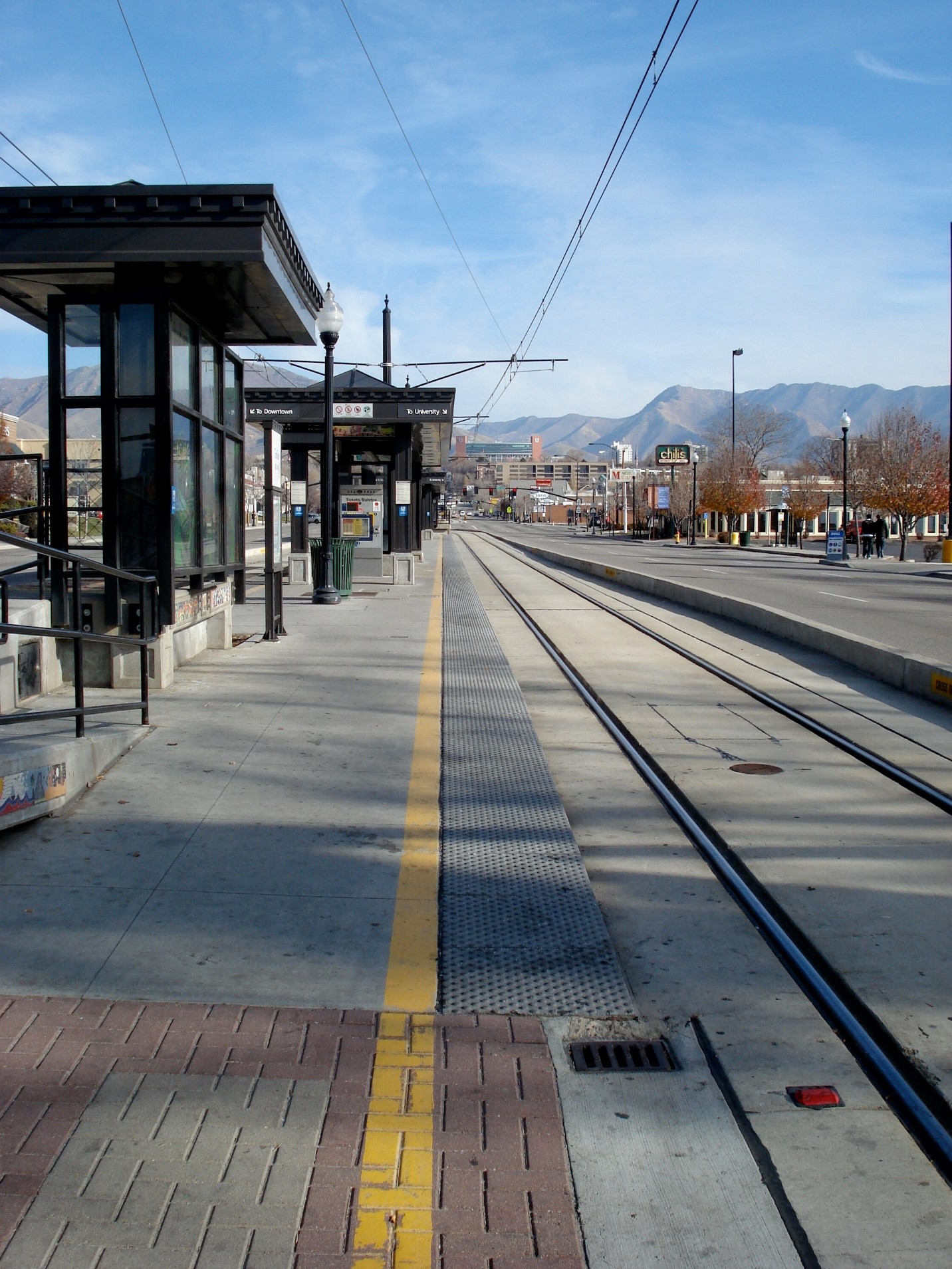
Trolley Station – Salt Lake City, UT
Perhaps trying to moving past this mistake, the new shelters proposed for the 2013 North Temple Bridge/Guadalupe Station (which serves both light rail and commuter rail) in Salt Lake City are decidedly different. The design by Hatch, Mott MacDonald, offers some excellent characteristics.
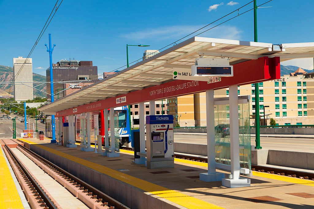
SLC Trolley 2
First, the shelters are narrow at the base to avoid clutter and to allow for easy circulation and safety. They are porous to allow movement from side to side. They have wide spanning canopies for good weather protection. They drain to the center, so that water doesn’t land on passengers’ heads. They allow for some natural light to come through, are simple, and basically get out of the way to allow for views of mountains and cityscape. And lastly, the name of the station is positioned below the canopy where it can be read easily by people on the platform and in the train.
SMART’s Option 2 shelters literally offer none of these important features.
Where to Go Now
For SMART, it’s been a continuous climb down on stations. They began with a professional design led by an architecture/engineering firm with transit experience, not unlike Hatch, Mott, MacDonald.
Then, SMART turned the design of stations over to its construction contractor, Shimmick. Now, they spear to be doing something even worse, taking hail-mary design advice from the Sonoma County Transportation Authority (SCTA), a funding agency with no transit operations, railroading, or architectural experience. It’s the SCTA who suggested the Option 2 bus shelters.
Cities along the rail line should not take the SCTA’s recommendation and should rally around shelter Option 1 for the good of the SMART’s system. While imperfect, it at least avoids the serious problems presented by shelter Option 2. If painted a more neutral color than the proposed forest green, it could be a respectable piece of station furniture.
Of course, while it may be too late, the best long-term outcome for both the riding public and taxpayers would be for SMART to implement a truly professional shelter design that considers the myriad details of the customer experience.
What do driverless cars mean for suburban planning?
Self-driving cars are coming, and boosters of drivable suburbia are hoping they will be a potent weapon against mass transit and cities. But what they mean for towns and suburbs isn’t quite so clear. For the past 80 years, the US has transformed nearly every place in the country into one that is acceptable and welcoming to the personal automobile. It needs places to park (some estimates have that there are 6 parking spaces for every car), needs enough road space to be able to drive unimpeded, needs sole control over the roads, and so on.
In places built in the past 30 years, this has meant sidewalk-free eight-lane boulevards and massive malls at freeway interchanges. In places built before the car, this has often meant their wholesale destruction. (Santa Clara and Fremont, for example, are now undertaking efforts to “rebuild” their town centers.)
This has not been in service to the car as a vehicle, however, but to the car as a personal mobility tool. Very often, the only seat used in a car is the driver’s, massively enhancing the person’s footprint and leading to all kinds of horrific traffic.
With the advent of the driverless car, the belief is that we will no longer need personal vehicles, and this excess footprint will become unnecessary. Open up an app on a phone, order a car, and a vehicle (possibly with others in it going to roughly where you’re going) will drive by, pick you up, and drop you off near your destination. Along the way it’ll pick up other people going in roughly the same direction as you, bolstering capacity of the personal car to a grand total of five.
Five trips, one car. As one Twitter follower called it, it becomes mini-mass transit, but at the beck and call of an app and as flexible as it needs to be. If this method of travel becomes ubiquitous – and that’s a big if – then the personal automobile might become a thing of the past.
What, then, of the places we’ve outfitted at great expense to fit the personal automobile? These would need to be retrofitted to fit this new dominant mode, and we can do away with some of design choices that favored the personal automobile.
Probably the biggest change is the demise of the large parking lot. These huge slabs of asphalt dominate suburban commercial landscapes, often taking up 80 percent of commercial parcels. They dominate the streetscape, and arterial suburban roads are lined with them. Without personal vehicles to park, there’s no need for a parking lot. That land could be put to productive use.

With a transportation system that’s five times as efficient, too, there’s little need for wide arterial roads packed with single-occupant vehicles. As well, without human drivers, there’s no need for “forgiving engineering” focused on driver psychology and driver needs. We can narrow lanes from 12 feet (freeway width) down to 10 feet or even 9.5 feet and have the same vehicle capacity and speed. There would rarely be a need for roads wider than 2 lanes in the suburbs.
So, we can wave goodbye to parking lots and wide arterial roads. What could we do to optimize the suburbs to fit this new reality?
First, trip origins and destinations would be best served if they are along the same axis of travel, and they should be relatively evenly spaced and close together. Street grids lined with origins and destinations make sense, so as to maximize the directness of the travel. That means either a commercial street with homes behind or above.
With the loss of parking lots, it makes no sense to place storefronts far back from the street. They should be placed against the street to ease access for passengers.
Finally, there will likely be a need for a short walk to or from a vehicle, especially when returning home. It makes sense to make that walk a pleasant one, and to put amenities there, too.

It’s important our density not get too high. Although boosting car capacity fivefold is a huge step forward, trains have eight to forty times the capacity. For the highest-density areas, where trains are already at capacity, driverless mini-mass transit won’t be enough to solve congestion or to adequately meet residents’ travel needs.
So in the retrofitted suburbs, there should be a balance between the need for a dense line of origins and destinations and the need to not overload the system. Perhaps just six stories, at most, in the most dense places of the suburbs.
For this kind of system to work and not devolve into that kind of nightmare, it needs to have simple and easy lines of operations, just like the streetcars did, with origins and destinations located near stops. Unlike streetcars, the whole street is a possible stop. Rather than a series of one-dimensional stops surrounded by a station area, there is a two-dimensional transportation corridor surrounded by a transportation area. The station neighborhoods currently in existence could easily be integrated into suburban corridor fabric.
At this point, this does not sound much like the suburbia we often consider “suburbia”. With no parking lots, no wide roads, a street grid, and shops and homes clustered up against the sidewalk, it sounds more like a town center. That’s because this transportation cloud functions much more like the streetcars of the old days than personal cars of today. The urban landscape described is precisely the kind of bus-transit-oriented development that suburbs could be investing in today. This article could have painted just the picture: "Imagine standing at almost any street corner, where every five minutes an electric train bus vehicle comes by..."
Indeed, if this system ever does overcome myriad regulatory hurdles, it will work best in places where buses and light rail work best. If this is our dream future, then we can start planning for it today. There's no need to wait for driverless cars.*
Of course, this system will likely be decades away, if it ever happens. There are huge regulatory hurdles to any driverless car, and any area where this system operates could be seriously disrupted by even one person driving their own car. As well, there are still questions of who owns and maintains the vehicles. In the interim, personally owned automated vehicles will likely start to ply the roads. (While they will reform how we use parking, they won’t do much about traffic.)
But if this system does come, it’s not something for champions of small towns, walkable living, and transit to fear.
*As people start to buy personal driverless cars, the need for vast parking lots will diminish. If we really want to start planning for that reality, too, then we should reform or abolish parking standards today.
AN ASIDE: This system has been speculated upon for decades as Personal Rapid Transit, or PRT, though generally it was theorized on rails. In fact, it already exists, in a sense, in Morgantown, West Virginia.
Much of the time, Morgantown’s system works like an elevator (push a button to summon a vehicle, push a destination button and you’re on your way). During rush hour, it operates like standard-issue fixed-route transit during peak hours, and in off-hours each car runs the whole track as a circulator.
Even as bridge tolls increase, gap with fares widens
This week, tolls increased on the Golden Gate Bridge for the first time in 6 years, to $6 with FasTrak. Though there was some grumbling and a bit of consternation from drivers who now need to deal with a more expensive commute, these cost hikes are no stranger to transit riders, who have faced annual fare increases for over a decade. A quick look at the discount toll and average discount fare (adjusted for inflation) starts to get at the picture:

Though it's obvious from above, the point is best expressed from the ratio of fares-to-toll:

In 1992, the average round-trip bus fare was 1.62 times the discount toll. That ratio reached a high of 2.44 last July 1, when the latest fare increase was made. Now that the tolls have gone up, the ratio has dropped to 2.03, the lowest it's been in 5 years, but that will be transitory. On July 1, when fares increase another 5 percent, the ratio will head back up again, to 2.14.
If fares continue to increase 5 percent every year, that ratio will continue to widen, even with annual $0.25 toll hikes, to 2.22 in 2018.
Strictly from an equity perspective, this is unjust. Bus riders tend to be lower-income, and so have a more difficult time taking fare hikes, while the opposite tends to be true of drivers. Not only that, but others who can't drive - those who are blind, albino, elderly, and others - are disproportionately hit by fare hikes.
By pushing away those who have access to the driving alternative, too, the fare hikes render transit more and more into a second-class social welfare service rather than the first-class transportation service it could be.
From a technical perspective, those new drivers adds to congestion at the rush hours, forcing everyone, rider and driver alike, into a slog every morning and night. It's a terribly inefficient transit system, destroying any advantage of having a freeway. San Francisco, Sonoma, and Marin all suffer.
Narrow goals lead to bad outcomes
The Golden Gate Bridge, Highway, and Transportation District (GGBHTD) has as its explicit goal that fares should cover at least 25 percent of bus operations and 40 percent of ferry operations. By raising fares regularly, GGBHTD is trying to hit that moving target. Bus ridership has dropped dramatically since 2000 and with it has fallen transportation income, while operating costs have jacked up the price of providing service.
To compensate, GGBHTD has hiked fares every year since 1998, boosting inflation-adjusted fares 82 percent.
The problem is that GGBHTD isn't thinking like a business, where income is more than just a function of price, and it's not thinking like a government agency, with broader societal concerns than mere income. The end result is a nonsensical and unjust policy of never-ending fare hikes far beyond inflation and ever-slower commutes.
Broaden the goals, reformulate the prices
The core technical mission of GGBHTD should be to help prevent congestion in the areas most immediately effected by its policies, namely Central and Southern Marin, and work with the transit and congestion management agencies in San Francisco, Marin, and Sonoma to prevent or mitigate it in the rest of its commute shed. This would fit with the original founding purpose of Golden Gate Transit, which was to resolve congestion on the Golden Gate Bridge.
To ensure its historic, technical mission is fulfilled, GGBHTD needs to rework its pricing scheme with congestion in mind. This will mean tolls will rise, but not necessarily too much. If fares stay flat or even decrease, that daily congestion toll may not need to rise nearly so much to ensure congestion is alleviated. Physical changes, such as creating carpool lanes on 101 as far as Lombard in San Francisco, will also help mitigate congestion and, therefore, that toll hike.
The core social justice mission for GGBHTD should be to ensure transit is a tool of freedom for the poor and car-free, rather than make this one more way they can't succeed. This would fit with the original purpose of having Greyhound take up the transit slack once our light rail system was put out of business by GGBHTD.
Yet progress is made in this equally historic social justice mission simply when GGBHTD meets its technical mission, which by necessity will decrease the fare/toll gap. If the district invests the new toll revenue in more frequent bus service and better bus infrastructure, it will elevate raise the prestige and enjoyment of using the bus system.
Finally, GGBHTD's efforts will increase ridership (and therefore fares), to meet its new mission of keeping fare revenue in sync with operating costs.
The ever-rising gap between fares and tolls is symptomatic of deep dysfunction in the heart of GGBHTD. An obsession with a single metric - revenue - has led to an incredibly inefficient transportation system and caused the district to fail in the missions it was founded to accomplish. Drivers, riders, the poor, the rich - all suffer under this scheme.
*As Golden Gate Transit doesn't keep historic bus and ferry fares available online, rather just fare increases, this is backwards-calculated from the average cost to travel from the North Bay to San Francisco on bus and ferry. GGT also doesn't keep historic fare increases available from before 1993.