GGT Seeks Bike Racks, Signage

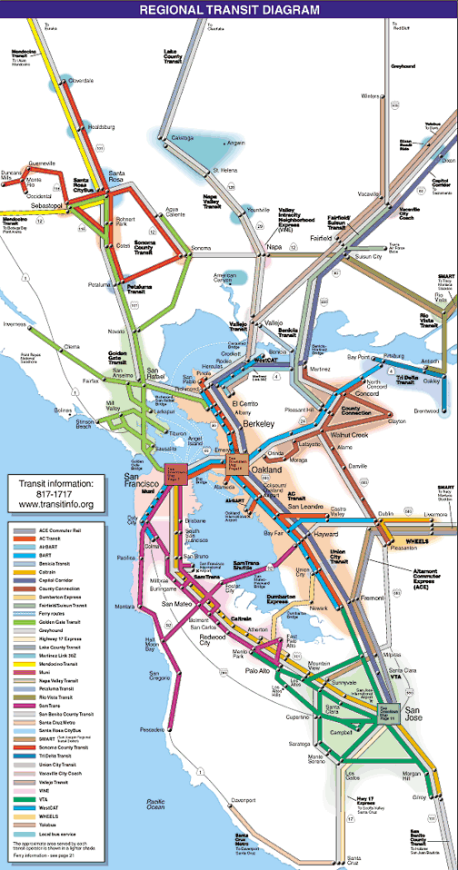
Golden Gate Transit wants to get Larkspur Landing and the Bettini Transit Center in downtown San Rafael new bike racks and new signage, indicating the agency is serious about integrating its system with the region’s, and understands that burgeoning bicycle usage is good for business. The request for bids (PDF) went up on GGT’s website two weeks ago and, though it’s always questionable if there will be any acceptable bids, it’s an exciting development.

Bettini Bike Racks

The Transit Center has 41 bicycle parking spaces at the moment. Though at the edge of a rather bicycle-unfriendly district of the city, the spaces fill up often. Google Streetview shows bicycles locked to poles and signs, and I’ve seen more bikes locked to fences under the freeway. Clearly, there is a need.

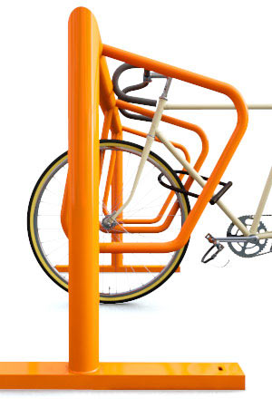
In response, the transit agency wants to install 25 new spaces using Dero double-sided campus racks scattered around the platforms. It’s unfortunate that none of these racks will be covered. Bicycle handles and seats will bake in the summer and get soggy in the winter, which can mean an uncomfortable ride home after work. On the other hand, most bicyclists who don’t mind riding down Fourth Street – or, God forbid, those traffic sewers charitably known as Second and Third Streets – can probably deal with some heat or wet. Besides, the Transit Center was built without much regard for bicycle parking in the first place. There just isn’t a whole lot of space under the rooftops.

Larkspur Landing Bike Racks

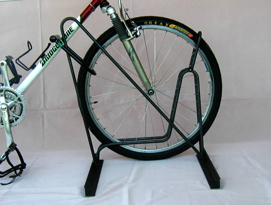
Larkspur Landing has 71 bike parking spaces – 60 outside the fare-restricted waiting area and a paltry 11 inside. GGT wants to replace the planter boxes lining some of the waiting area with 56 new bicycle spaces. The racks will be Peak Racks' single-sided campus racks.

Given the crunch of access to Larkspur Landing, this makes a great deal of sense. For whatever reason, neither Marin Transit nor Golden Gate Transit have made Larkspur Landing bus service a priority, though this will change with the Greenbrae Interchange Project. Parking is at its limit, too, and unless there's space to either take bicycles to the city or lock them at the terminal people will choose to drive instead.

Signage

Both the Transit Center and Larkspur Landing are going to get new signage, and this is just as exciting as the bike racks. All signage will be in the style of MTC's regional transit hub signage initiative (PDF), meaning branding and stylistic consistency between Marin's major transportation hubs and those in San Francisco and the East Bay, putting our transit hubs on the same level as BART stations.

If the map suite will be the same as what we find in the East Bay (PDF), we can expect four displays. First is a station map, indicating what stops where. Though the Transit Center already has such a map, theirs is rather less intuitive or stylish than the MTC version. Second is the vicinity map, showing the streets, transit stops, and points of interest within a half-mile radius. These are typically found in kiosks in the City, and would be extremely useful down Fourth Street as well. Third is the local system map, showing where transit goes in about a two mile radius. Last is the service display, showing all services with fare information, timetables, transfer information, and the like. GGT wants to add a bicycle parking map, which will be in MTC's style though will be locally produced.

The drawback is that it seems like these signs won’t have their own internal lighting. The design documents show nothing about internal lighting or electrical systems. For those who are hard of seeing, this might be problematic. The Transit Center's internally-lit ad kiosks look great, and it's shameful that it's easier to see that you should buy Chanel than it is to see how to get home.

History and Cost

The project has been in the works since at least 2009 when the Bridge District applied for $245,000 in federal highway money through MTC. A $40,000 project was approved, but the project didn't get going until this year. Costs will be covered by FHWA if, of course, the bids that come in are acceptable, and that’s not a sure thing.

This is a move in the right direction for GGT. MTC has called on the agency to upgrade its signage and wayfinding to be in line with regional standards. Given the mediocre stuff currently on display – not to mention the moldy and cheap printouts you can find on display – this will move GGT out of the 1980s. Indeed, for the Transit Center it has been six years since MTC pushed GGT for change (PDF), so it's great to see the agency finally taking signage seriously.

With more people riding bicycles for everyday transportation, too, more racks will mean better transit access, and more parking, for those that need it. Bicycle use is exploding across the country, including Marin. By adapting to the times, GGT makes its transit infrastructure more flexible for the whole county.
Unsuck Golden Gate Transit

For those of you that don’t know, I’m a Marinite that lives in Washington, DC, so commuting by GGT isn’t exactly normal for me.  (If you’re wondering why I blog on Marin issues while living across the country, my FAQ has a bit more detail.)  But, I’m home in Marin for the next two weeks for Christmas, giving me a golden opportunity to try the GGT.  I've written about maximizing our bus system before, but there's nothing quite like on-the-ground experience.  My few days have been eye-opening.

There were a number of general problems with GGT that I noticed immediately.  As one that lives on transit – I don’t own a car – proper wayfinding, signage, and branding is really important to me.  For the same reason some people want nice cars, I want nice transit that’s clean, efficient, pleasing to look at, and a pleasing experience to wait for.  What I got instead was this:

  • Poor signage.  The transit pylons are ugly, not weatherproof, and the signage typically consists of timetables printed on office paper, which melts when the rain gets inside and turns brown when in the sun too long.  There are often no route maps, no system maps, and no regional maps.  There were system maps at the San Rafael Transit Center and the Lucas Valley Bus Pad, but GGT had printed them so small I almost needed a magnifying glass to see where routes stopped.  As well, there were no timetables for routes that didn't come to that stop, forcing me to check on when the various exceptions to routing occur and leaving me in the dark as to whether I could switch to that service.
  • Poor shelter.  I boarded GGT at Polk & McAllister, which is the last primary stop for the service in San Francisco, but here is no shelter and no bench.  Despite its prominent position in timetables and relatively high volume of traffic, GGT treats the stop like an afterthought.  All they gave us was a pylon on the sidewalk with water-damaged route numbers and timetables.
  • Poor lighting.  I stopped by the Transit Center Saturday night and found the advertising far superior and better lit than the cheapo signage.
  • Lack of next bus departures.  Although I had brought with me a departure timetable, I had no way of getting this information otherwise, nor did I know if the bus had been early and I had missed it.
  • Lack of next stop information.  Despite long distances between stops and long headways, GGT chooses not to have its buses display which stop is next.  Given that the technology that enables this is the same technology that enables next bus departure information, this should be a top technology priority for the system.
  • Slow boarding and exiting.  The back doors of some GGT buses are almost vestigial, as they are not for boarding – despite the presence of Clipper readers – and they have signs imploring customers not to exit via them.  This means all boarding and exiting must occur at the front, forcing boarding passengers to wait for exiting ones to exit and forcing Clipper owners to wait while other passengers fumble for proper change.  Frustratingly, the buses that do allow rear exiting don't have Clipper readers, so Clipper users still need to exit the front to tag out.

Why is it like this?  GGT sells a valuable commodity – mobility – but it treats its customers like a burden.  The cheap and ugly signage screams to customers that the service is similarly cheap and ugly.  The lack of shelter tells customers they aren’t wanted.  The poor lighting says GGT doesn't even care about what signage is there.  The incredibly inefficient boarding and exiting tells me that they either prioritize the needs of the bus driver over those of the passenger or that they bought the wrong buses.

Many bus stops have shelters, but some of the major ones don’t.  There is money to buy shelters, but the distribution seems haphazard.  The same goes for lighting – properly lighting one’s signs and shelters goes a long way to ensuring the experience is pleasant for the passengers.

Real-time arrival (next bus) kiosks are inexplicably absent.  Although GGT equipped its buses with GPS to enable accurate Clipper Card payments and with WiFi internet, two major parts of a next bus system, the back-end infrastructure to enable next bus information is not in place.  GGT makes up for this by being highly punctual, which could, in theory, enable next bus displays to count down to the next scheduled departures instead.  MTC uses just such a display using GGT information in its style guide examples, but the district ignores what MTC developed and I saw no next bus kiosks anywhere except MUNI and BART.

The most advanced and useful piece of technology used is the booklet available on every bus, complete with route information and system maps.  While better than nothing, the maps don’t include a regional transit map or even a list of other transit services, rendering them less useful than they might otherwise be.  In addition, the schedules are inconsistent as to which stops are listed.  For example, the Lucas Valley Road bus pad is listed in some routes (the 49) but not others (the 70, 71, 80, and 101), leading the inexperienced passenger to believe those other routes bypass the pad when that's not the case.  GGT should choose which stops appear in the schedules and list them consistently.

This is made all the more frustrating because it doesn’t need to be this way.  MTC has a signage design document (PDF) that includes the Transit Center in its examples, so something better already exists on the MTC servers.  GGT need only spend a little money to have it installed, which would be part of the MTC Hub Signage project.  Other information, such as route numbers and timetables, could at least be laminated to prevent destruction by water and sunshine; using translucent plastic tiles would be even better.  Installing monitors to count down the next arrivals and departures would enable passengers to wait in peace rather than in trepidation.  Allowing Clipper Card holders to enter through the back door would encourage adoption of the card, and allowing passengers to exit through the back to speed boarding and offloading.

GGT isn’t trying.  Although it is the only possibility for good access to Marin, although it is the only way for carless San Franciscans to find Marin and although it is the cheapest way for Marinites to move around the Bay Area, GGT seems to deliberately ignore or overlook simple solutions, many of which MTC has already developed.  Indeed, some of the recommendations here were made five years ago by MTC itself (PDF).  The return on investment could be huge, but for some reason the Board relies on cheap half-measures and ignores the effects on its image.  Marin and Sonoma are incredibly wealthy counties, lands of the Cadillac, but their transit service sells itself as a Gremlin.  The North Bay deserves better.