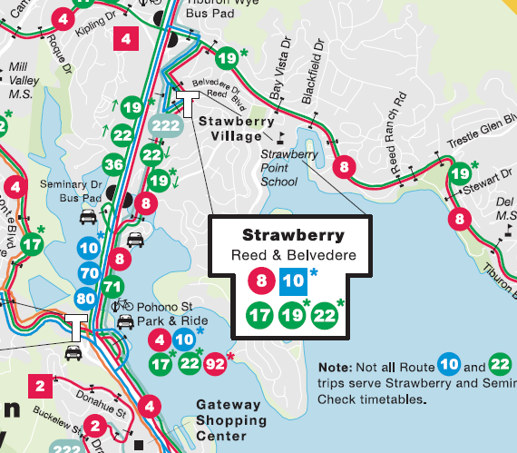
 Marin isn’t known as a transit-oriented place, despite its deep green ideology. While fewer than 45% of San Franciscans drive alone to work, a full 74% of Marinites do. In other places, low transit ridership is due in part to the opaque nature of bus routes and schedules, and GGT is certainly opaque. What might it do to become more transparent?
The first problem is one of bus routes. Many riders, if they don’t know a bus route, don’t know where they’ll end up if they board the bus. Unlike a rail-based system, riders can’t look at the rails and see where they go. Only specialized knowledge, gleaned from studying the bus map or utilizing wayfinding tools like 511.org, would allow an inexperienced user to utilize the bus system by feel.
Transit centers present a special difficulty because of the plethora of options. If I want to go from Sausalito to the Seminary Drive bus pad, I first need to check to see what bus numbers depart from Sausalito, then what routes look like they might serve Seminary Drive. The 70 and 80 have asterisks next to them so I don’t know if they’ll come by Sausalito. The 10 might, too, but it also has an asterisk that says it might not serve Seminary. The 22 probably does, but getting back I might need to get on someplace else because it looks as though it veers off someplace near… Forget it, I’m taking the cab.
This should not be so hard! I look at maps like this every day in a much more complicated bus network and this confused me. Any route that hits Seminary Drive from Sausalito doesn’t even always make it to Sausalito or Seminary Drive. I only know this because of side notes that say, “Check timetables.” On top of that, there isn’t an easy way to say that every X minutes a bus departs Sausalito for Seminary Drive.
What if I don’t want to go to Seminary Drive but want to see where I can go from Sausalito? I’d know the end points but not the stops in between without studying the map to find the small numbers and make sure the tiny color lines match up with the numbers’ coloring. Knowing where to go has turned from easy to highly technical, and this is only a small transit center; San Rafael would be significantly worse.
Without dramatically altering the routes to be more consistent, good graphic design can help lower the barriers to bus usage significantly. One of the best ways to address wayfinding is what is known as a “spider map”, a concept widely used in London’s bus system. It takes the jumbled mess of bus lines near a Tube station and charts them out to their ends, with major stops marked.
It does this in a cartogram, rather than a geographic map. By removing the geographic data and showing only the most important stops, the map can most effectively highlight the most useful service data. Differing line colors or patterns show visually the various exceptions to the rules, such as partial or peak-only service, and general trends of service, such as which “trunk” the line goes along or bus headway. This grants the bus system the same clarity as a subway system and visually associates the lowly bus with the ease and comfort of rapid transit.
Making buses work for casual riders is a perennial problem. Even here in Washington, DC, I know many people that live here months or years without ever boarding a bus. Understanding the bus system is seen as Deep Knowledge of the system’s otherwise impenetrable black box. Yet in Marin, the bus is our only mass transit option. It is imperfect, but it is comprehensive, and converting a driver to the bus will require it to be much more than the confusing map of seemingly random lines it currently is.
This addresses casually knowing how to get someplace, but knowing when to show up for your bus is still a problem, one we’ll address next week.

