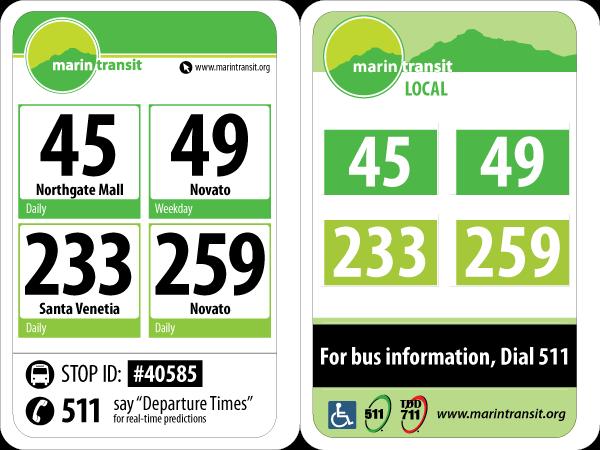
Bus stop signage is an important part of the transit landscape. It can offer a window into the often-opaque routes and numbers that can mislead or confuse inexperienced riders. To help make Marin Transit stops more accessible to the casual rider, MT has proposed a new set of signs for its shuttle stops, and the results are decent.
What's proposed
At the moment, the bus stop signage is limited to route numbers and some branding. There's a little bit of extra information, but for the most part it's assumed riders will use the map that's often on the flag to determine where buses go.
The proposed signage adds data and makes the route numbers more clear. Below the route is the destination, and below that are the service days. Though not frequency data - a valuable part of any bus map - it does allow a traveler to at least know that they shouldn't bother waiting for a route if it doesn't run that day.
Most importantly, the sign adds the stop ID and how to get real-time arrival information. Though GGT isn't there yet, MT already has real-time arrival data for the bus fleet it operates.
These are all excellent ideas, but there are problems when incorporating GGT's regional routes in the signage.
GGT's regional routes, however, do not get destination or service information. On the sample image, routes 40 and 42 are just big numbers without any indication that they're bound for BART. As well, the route number's box isn't colored blue, the color of Basic routes maps, which is out-of-step with coloration for the MT shuttles and GGT-operated local routes. While possibly a conscious decision, it is nevertheless the wrong one.
What have other bus systems done to aid riders with signage?
Practices elsewhere
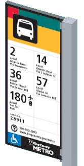
Seattle's bus system underwent a similar redesign for its stop signage, and the result was similar, though there are differences. (See Seattle's design manual here.)
Most significantly, the Seattle stop signs use tiles, which allows the system to easily take out or edit route information as needed. If a bus used to be routed to the airport and isn't, Metro can just remove that tile from the route's signs rather than order entirely new signs. And, at the stops the route no longer serves, Metro can just remove the line's number. While more expensive than a typical sign, the tiles would save money over the long-term if service changes effect a large number of the metal signs.
Something else of note is the use of icons to show what services this particular route intersects. Marin's transit system includes ferries and airport shuttles and will soon include a train. Designating transfers to alternative modes may be of use. Designating routes that intersect the 101 trunk lines may also be useful, though that would involve a unified brand for such service. A black highway shield may do the trick.
London's bus stops use a similar design, but its bus stations do something a bit more horizontal, with more potential points of interest. If applied to Marin, Route 49 might list Civic Center, Lucas Valley, Hamilton, and Novato instead of just Novato. (You can find their design manual here.)
How's the sign?
My principal concern with the MT signage as proposed is that it does not visually integrate with either the GGT system or the MTC regional hub signage standards. This is problematic, as a unified brand for the transit system is important to rider literacy, especially for the casual rider. It makes little sense for them to proceed, as they did yesterday, without first developing a unified standard.
Given the prominence of the San Rafael Transit Center to the transit system, it would make sense to take inspiration from the signage there, which will meet MTC standards, rather than to invent a new visual language from scratch.
From a physical design perspective, it may make sense to design these signs to be modular. That would decrease the cost of route changes, as new signs wouldn't need to be stamped along with new route books.
Nevertheless, the new sign is still a step forward from what exists today. But it would be nice if MT would start thinking a bit more regionally.
If you want to offer input into the newly-approved signs, you can take the survey here.

